Pitstop in Purgatory
The Art and Character Design of Pitstop in Purgatory
Hi everyone!
Today we've got a special treat lined up for you, it's a guest write-up by Pitstop in Purgatory's artist Alcinus!
Read below and learn about the art process that lead up to the cast design of this lil' game.
Enjoy! :)
-----
Hello, I’m Alcinus and I’m the artist for (the hit game) Pitstop in Purgatory!
On @lenlen403’s (Twitter) request, I’ve written down some of the preliminary ideas and drafts discussed between Tymedust and I. It’s a lot of rambling, but I hope you enjoy it and can gain an insight into how Purgatory came to be!
The original idea for the game was more horror-like, so to quote Tymedust himself:
I haven't written too much of the love interests' stories yet, and how they look is also up in the air. I want them to look presentable enough to feel datable, but also have the horror-ish vibe of your earlier work, to fit the game's style.
This has remained a theme for the dateable characters of Purgatory, despite the game straying from the horror genre quite a bunch.
Before elaborating upon the character designs, I would like to share a fun fact: at least 50%, if not more, of the artwork in PIP is done in MSPaint! Of course, it has its limitations, so I needed to get some outside help, but I hoped to keep the aesthetic. The sprites are rendered in MSPaint with the backgrounds made transparent by hand!
Below are some quick preliminary sketches of The Guide, who ended up being the first character to gain his physical form, yet one of - if not the - last one to get finished up!
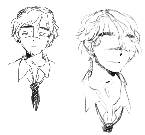
Originally inspired by sort of a tired, rough-ish bartender or businessman look, he might have been meant as a love interest right off the bat?! We may never know. In the end, his design definitely caught on for The Guide, and he went through some subtle but significant changes, despite his earring and scar remaining.
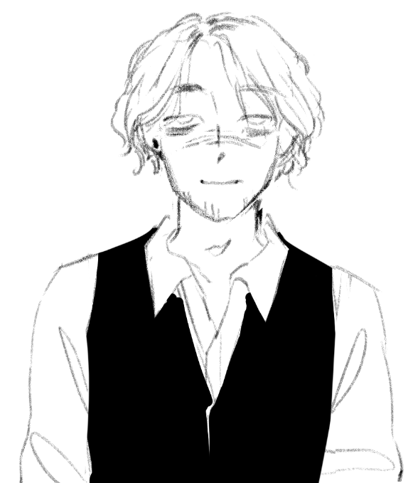
(Now, he feels like The Guide! The final sprite was based off this sketch.)
His non-bartender outfit is another can of worms. I was originally vouching for his outfit to be colored white…
The cloak idea is like, I just envision this "acolyte"-ish look you know, when you get to Purgatory and he's there like, obviously he's "hired by someone", like he's an underling or something to something greater. I mean he isn't "God" (or is he? - who knows) lmao
In the end, I got thankfully convinced otherwise.
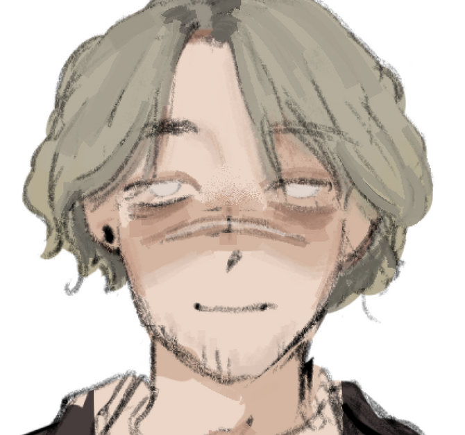
(An in-progress screencap!)
Next up is… Drumroll… The pasta man! His design remained extremely consistent from the beginning, in my opinion, he just aged a little (mentally). I love drawing medical-ish stuff, so his design was a bit of a guilty pleasure for me. I originally called him a “pretty boy sterile doctor”, thus the eyelashes.
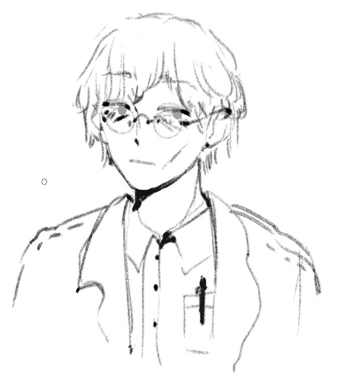
Somehow, the whole doctor deal caught on. Here is our dear Volumnius with improved glasses, and some facial changes, which ended up becoming his sprite.
His outfit seemed quite bland to me, so I included a pin of the caduceus, not for any good reason but rather for the design. Oops!
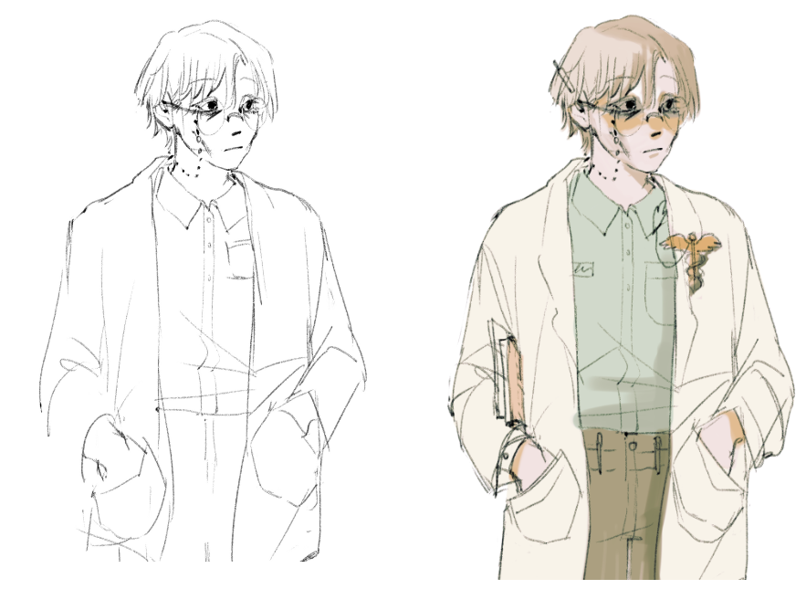
His shadow design doesn’t have that much going on, but I quite enjoy the mad scientist look he has with the shining glasses!
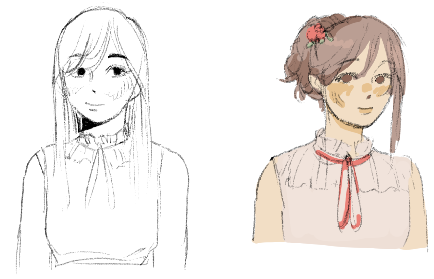
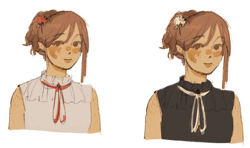
Next up, we have poor Rahel who went through all hairstyles imaginable.
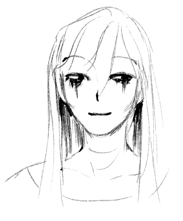
(I don’t want to talk about the haircuts. However, this one got reused with Astrid a tad.)
Somehow, I liked her original sketch so much it ended up making the final cut for the final sprite. Here she is, with better hair, and tons of rendering to do - and then, an in-progress version.
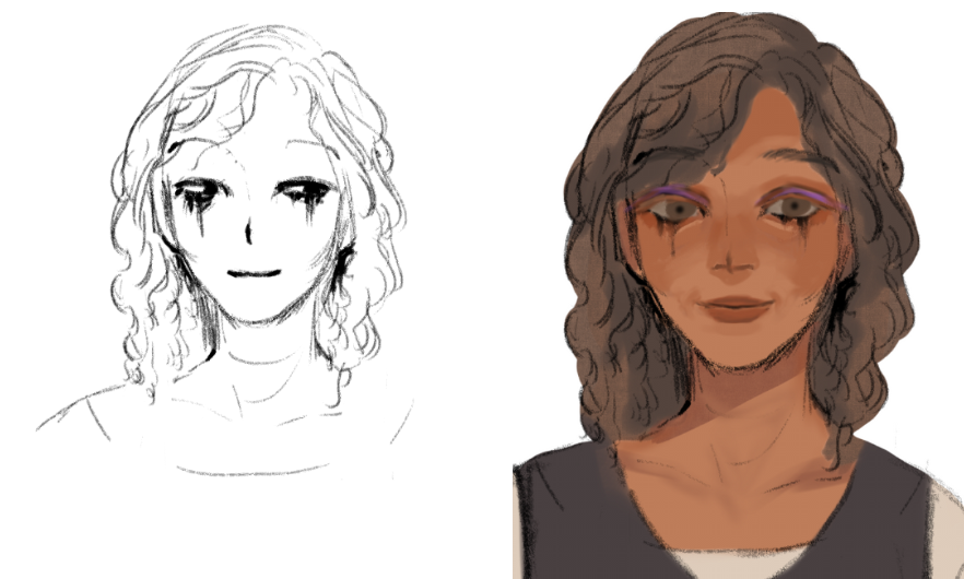
(Originally, she wasn’t meant to be medieval-ish at all, just a bit retro…)
Her runny makeup was for the horror look, but her purple eyeshadow is meant to be reminiscent of someone who enjoys makeup, but is a bit off on the current trends lol
Some of the embroidery on her blouse is slightly inspired by central to eastern european folk costumes.
I believe she ended up being Tyme’s favorite design out of them all, and that she truly “fit” her character?!
Then - even though Locke got some sketches before her - there’s Astrid. Our lovely actress had her design near set from the start, excluding her color scheme:
I took inspiration from the designs of other MCs in otome games, however I intended to put my own twist to it, so her original color scheme was NOT working. I am, however, happy, that her face stayed basically the same throughout it! It’s always been her from the start.
I got feedback that she looks a bit too much like a doll, and I had to agree, so I added freckles, saturated her colors overall, and ended up with maybe an over-saturated mess, but in my humble opinion, it suits her!
played around with her colors just a little bit, i would say she looks much less like a doll if i up the saturation and make everything a little darker?
Then, the last addition was her slightly kitsch skeleton hand hair pin, which I’ve seen on someone in real life and thought it would suit her. :)
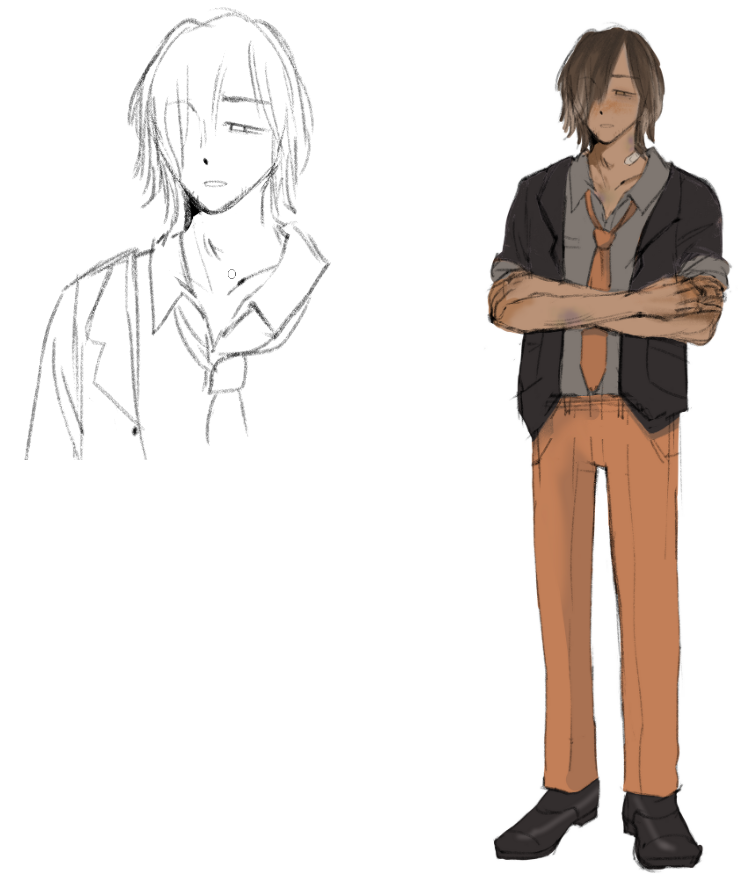
And, near last comes Locke. Oh boy was it a journey.
Locke might have been the hardest to design overall, with both of my original attempts having become The Guide and Vol. Ouch…
The start of properly designing him was me researching into 1920’s men’s fashion, realizing it was all suits, and then going along with it nonetheless. Before this, this was the only Locke sketch I had:
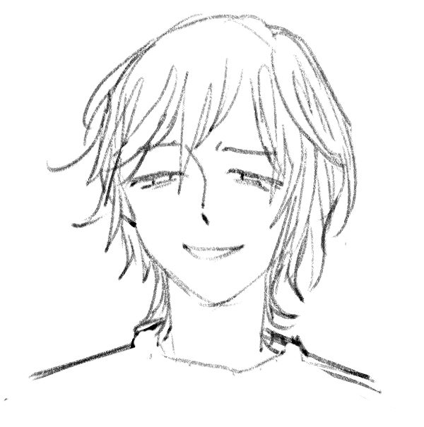
(A loveable yet punchable bastard was my first idea for him as a love interest..?)
Tymedust suggested for me to take inspiration from the TV show Peaky blinders, which I have never seen but helped a great ton with figuring out his clothes in the end lol
We also both agreed that he should look both professional and rugged, which was definitely a bit of a pain to figure out. I also noted that his eye disappeared over time.
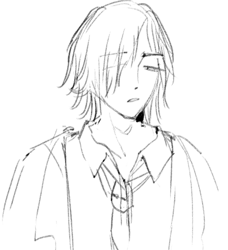
Somehow, I managed to “capture his essence” and this sketch caught Tyme’s eye for looking, quote, “disconnected, and beautiful/tired”. We both then agreed that he should have a stubble because he was a bit too much of a pretty boy without it. (That’s Vol’s role!)
I also wanted to add some surface injuries to him, for… No proper reason at all. It just seemed to fit him, and now it’s a part of him forever. Well, I guess getting into fights isn’t too out of character for him after all.
My friend brought up two-toned hair, and upon thinking about it a little, I realized that 1. it looks GOOD on him, and 2. that I have heard before that it can happen naturally. Thus, his hair was set.
Here’s the sketch that made the final cut:
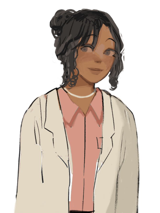
Finally, last but not least, Remm.
I was not aware of her “final role” in the story at the time of designing her, so I was thinking of a slightly mysterious all-knowing doctor friend to Vol. I think… She’s incredibly cute…!
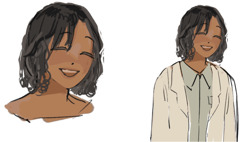
(The first sketch of her, which I may have gone a little overboard with.)
She originally had loose hair, but it looked a bit similar to Rahel’s, just a bit shorter, so Tyme suggested a little bun. Originally, she was meant to be wearing the same clothes as Vol, however that was quite simple and didn’t show her personality very well. Around this time I looked into what kind of accessories are allowed for doctors, and, well, not many, aka anything dangling is a no-no.
Thus, Remm was born, now more painted!
So that’s a wrap. Thank you all for showing interest in the world of Purgatory, thank you for enjoying the characters I’ve helped bring to life, and thanks to Tymedust for the opportunity to work on this game!! It has been an absolute blessing and we will see you soon once again.
Comments
Log in with itch.io to leave a comment.
okay putting guide's designs first was a terrible idea. i just spent like 10 minutes staring at it giggling like a school girl SLDFSLEKJRNRLJGNS //kidding (or am i?
also!! omg i would never guess about the MSPaint! it must have been a pain to make the all bgs transparent by hand (but i'm grateful for it tho thank you for your hard work!!!!)
and LMAO i cannot imagine guide using white AT ALL. i mean, his shirt is white but. the black cloak is so much fitting aljgsdlfgjns
aww, and the caduceus' pin really makes vol shines :') pretty boi
reading the rahel's original idea of being "just retro" reminded me of my first impression of her makeup. i was like... "purple...?" which makes me think of the 90's and stuff, and now it makes a lot of sense!
also............dont kill me but..............................i only noticed that astrid's hair pin was a skeleton hand like.......................................................................................as i was reading this..................oops..........(i know is mentioned in the game but i just........ didnt see it.....................)
and LMAO LOCKE'S FIRST SKETCH LOOKS SO PUNCHEABLE LMAOOOOOOOO
i remember that somewhere in my gameplay i was gazing at locke's sprite for no reason then i went like "wait..... wait!!! WAIT!! HE HAS SOME SURFACES INJURIES!! SMILEY WAS IT YOU-- LMFAO" (it is still my headcannon sorry not sorry)
also! the poliosis of his hair is a very nice touch. i only heard about albinism and that was very interesting.. (also does vol have albinism?? i always wondered that. it is also one of my headcannons lmao)
and as much as i don't like to admit, remm's design IS kinda cute. i love her necklace not gonna lie..............
thank you so much for showing a bit of the art process!! it was very interesting and nice to see all the changes that lead to the final result. i LOVE the art of this game so much omg....... and everything about this game tbh fkjndkgnsg. thank you again!! :))))Happy that you enjoyed the read! :) <3