Graphics in Visual Novels - Devlog #5
Graphics in Visual Novels - Devlog #5
Current game word count: 21,642 (+ 2283 since last devlog)
Hello everyone! :)
Before I head into the subject of today's devlog... some milestones that have been reached since last week!
* 20k words reached! My game is now longer than my university thesis!
* 500 views total for my logs! And almost 100 views total on my game! I know that these numbers are super small to some of you, but for me it feels huge! <3
So grateful to all those who choose to read through my game related ramblings! :) Heh.
And on that note...
Graphics... in visual novels?
When speaking of graphics in a game like mine (i.e. a visual novel), you'd more often than not probably be referring to either the game's artwork and/or the game's interface. Visual novels by their nature don't usually offer things like cutting edge 3D animations or smooth 2D pixel art... you know, things that make people go "Ohhh, this looks super cool!". Though there are of course exceptions.
Enter me! I'm about as graphically inclined as a mosquito (and that is probably an insult to those horrible flying things, actually). I said to myself early on in development that graphics will always be secondary to the writing (probably a testament to me growing up playing old-school PC RPGs which rarely had impressive visuals). And that is still true. Buuuut... I can't deny that I've been super energized receiving new artwork and interface ideas from my talented artist Alisa to spice up the game.
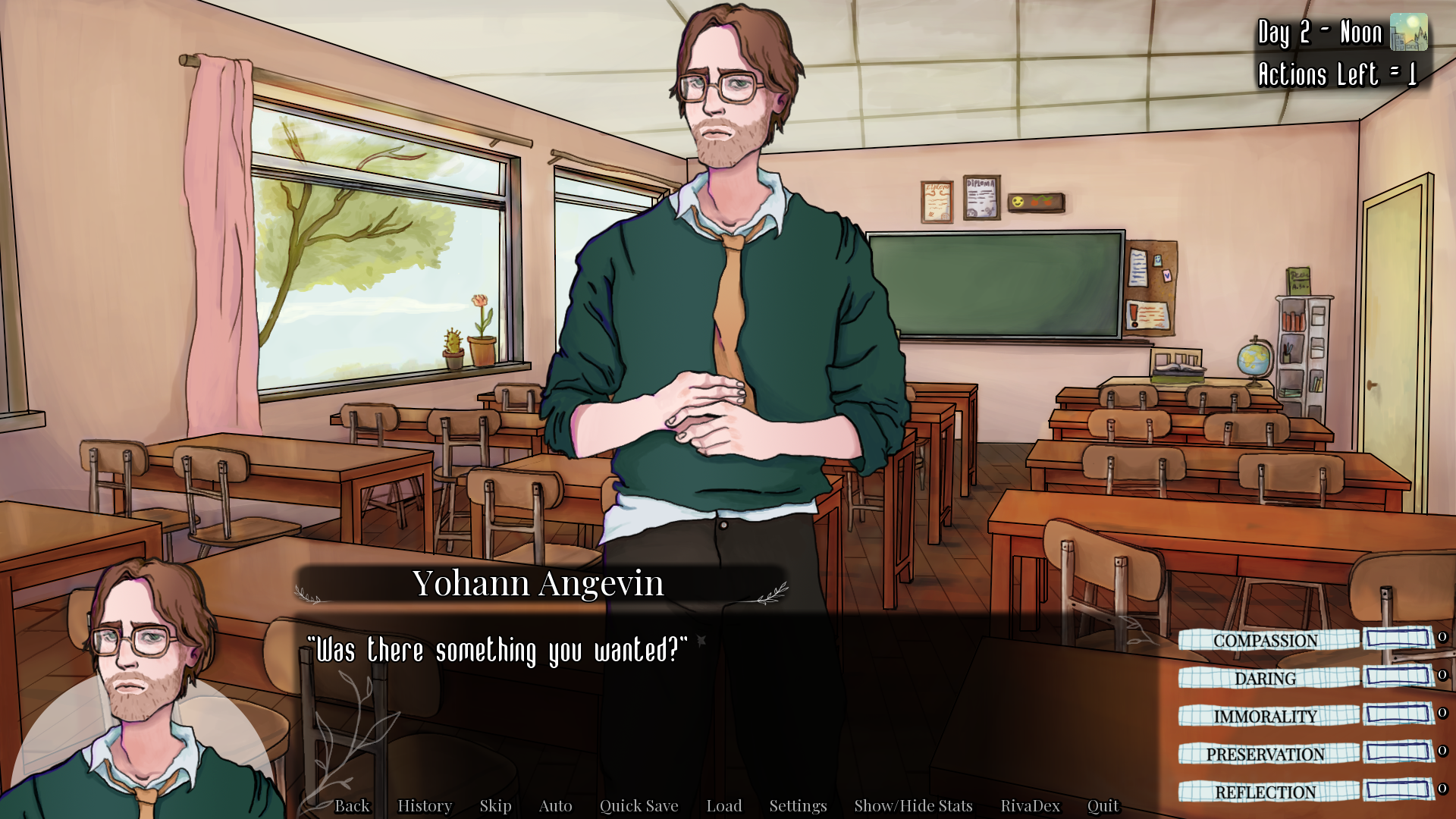
Just take a look at this recent upgrade!

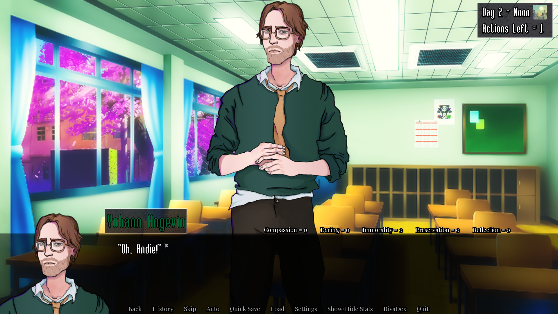
And for reference, the old version (which I used to kind of like but now it makes my eyes bleed...!). You guys might remember this scene from an earlier devlog about sidequests in visual novels.

To me, it really is night and day!
I've been super inspired by other visual novels and I've really tried my best to put Alisa's assets to good use, interface-wise. And it actually adds to the game's fun factor when the HUD is prettier, somehow! Ain't that something?
Let's dwell on details for a while, and compare old and new:
1. The background. The old one was a placeholder and didn't mesh with the artwork of the game at all. Alisa drew a classroom instead, and it's just sooooo clean! *chef's kiss* It's really important to me that the individual parts of the presentation feel cohesive when put next to each other.
2. Name box. Old one was... passable, I guess. The background image of it matches the day/weather display (top right) and is a minimized version of the RivaDex's background (the RivaDex is the main menu display which shows character relationships etc). New version is just soooo much better though. I also changed the font of it so that it wouldn't clash with the text font. Lastly, I dropped the idea of having colored names. I was running out of cool colors and it bugged me greatly that some were easier to read than others.
3. Day/weather display. Changed the background... smoother now.
4. Text box. Made it smaller (it really had no business being that wide, lol). Added cool graphics that fit Riva City's foresty (is that even a word?) environment. I really dig it, personally.
5. Background image (half-circle) behind the character's side image. This is one of my favorite additions, and an idea I stole from Dream Daddy which my wife is currently playing. It bugged me to just have a floating head there, so this one is just pure visual improvement.
6. The stats are now in image form and on the right instead of above the text box. Man, it bugged me so much that there were so many words and numbers everywhere, the stats looked extremely unappealing for the longest time. Now, the HUD is cleaned up and the stats are easier on the eyes, with bars that visually show your stat growth added as well. The "textbook" buttons tie in with the interface of the RivaDex menu, adding to the cohesiveness of the game's presentation.
Artwork and writing...
Some games have really killer art, and I've seen them gain huge followings despite subpar and derivative writing, especially the latter. And that's fine, of course! But for me, graphics will always be secondary to coming up with an engaging plot, hopefully giving my players something that feels fresh in the world of visual novels. A world where, in my opinion, sameyness is kind of rampant.
Feel free to leave a comment!
Let me know what you think of my game's interface changes, and/or about graphics in visual novels in general. It's an interesting topic for sure!
Would love to hear your input! :)
Thank you for reading, and have a Riva-tastic day! <3
/Tymedust
Get Meanwhile in Riva
Meanwhile in Riva
Time to solve a paranormal mystery!
| Status | Canceled |
| Author | Tymedust Games |
| Genre | Visual Novel |
| Tags | Atmospheric, Funny, Horror, Meaningful Choices, Multiple Endings, Mystery, Point & Click, Romance, Story Rich, weird |
| Languages | English |
| Accessibility | Subtitles, One button |
More posts
- Meanwhile in Riva - Soundtrack Out Now!Jan 20, 2023
- The State and Future of Meanwhile in RivaMay 13, 2022
- List of Additional Assets Used For the GameApr 24, 2022
- Meanwhile in Riva (Part 1) - OUT NOW!Apr 22, 2022
- Meanwhile in Riva (Part 1) Releases This Friday! - Weekly Devlog #27Apr 18, 2022
- I Made it Through NaNoRenO 2022! - Weekly Devlog #26Mar 27, 2022
- Time For Weekend Crunch! - Weekly Devlog #25Mar 17, 2022
- Images From "A Day in the Life" + New Branding! - Weekly Devlog #24Mar 07, 2022
- I'm Joining NaNoRenO 2022 - Weekly Devlog #23Mar 02, 2022
- Gearing Up For the New Demo - Weekly Devlog #22Feb 22, 2022

Leave a comment
Log in with itch.io to leave a comment.